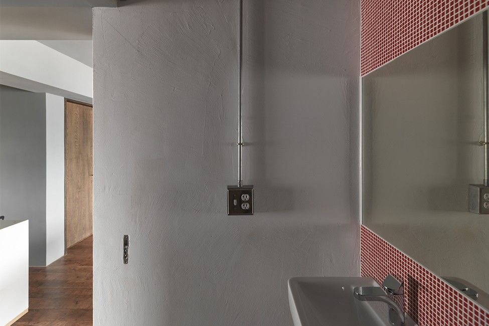
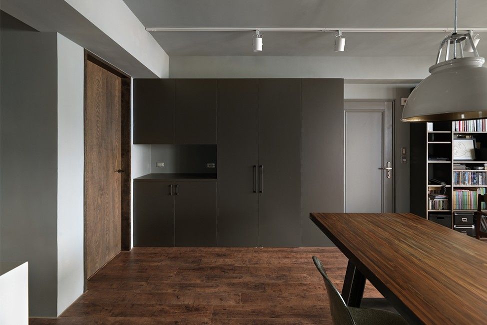
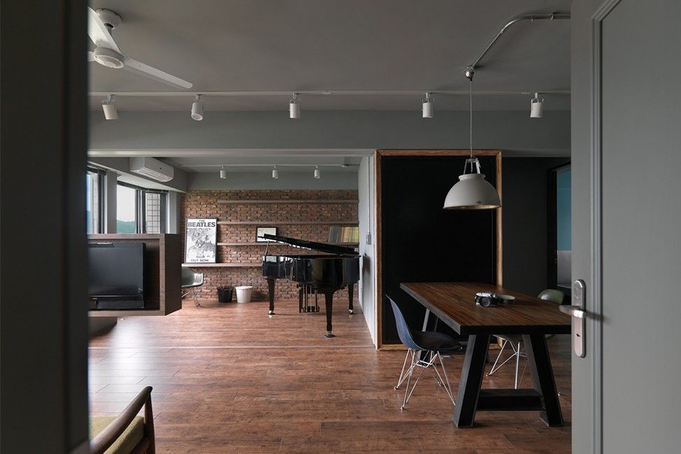
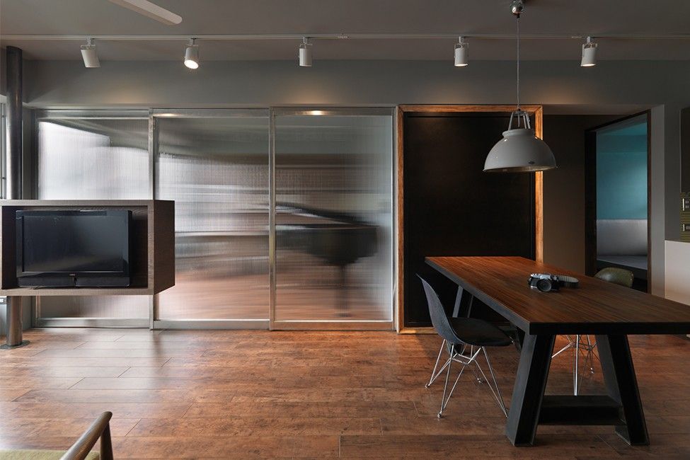
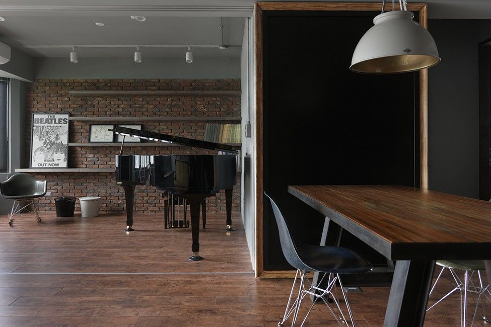
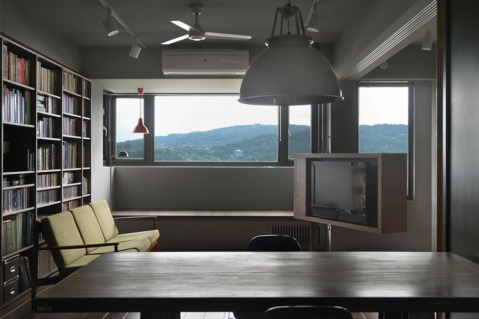
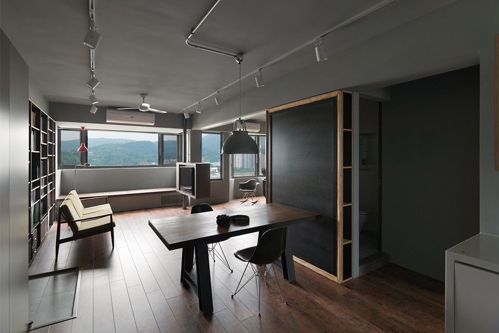
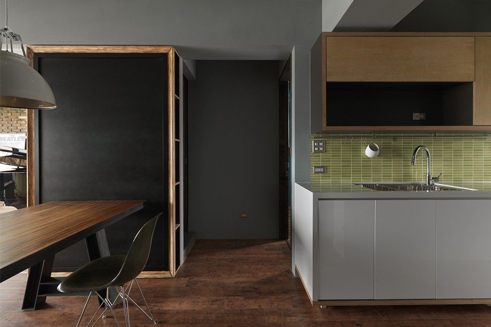
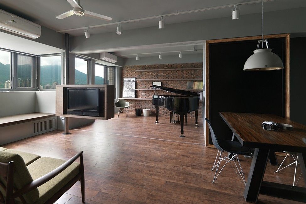
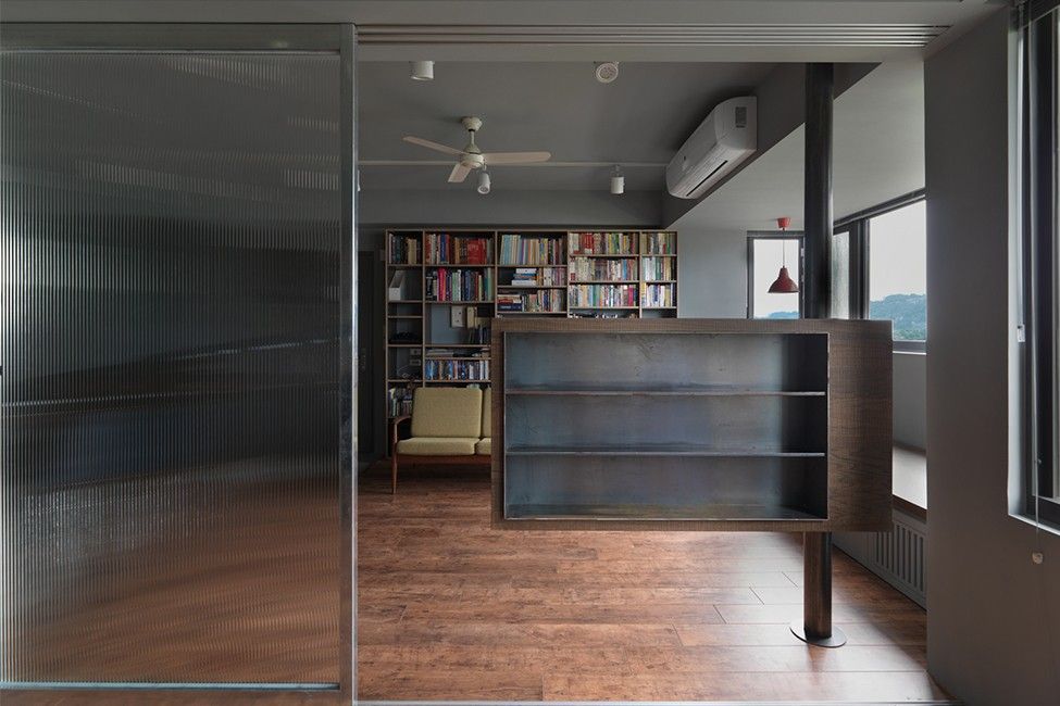
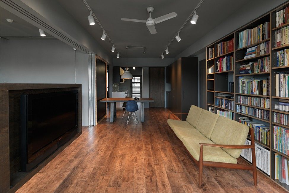
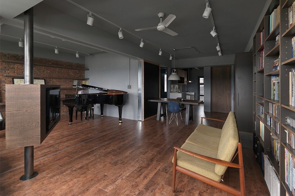
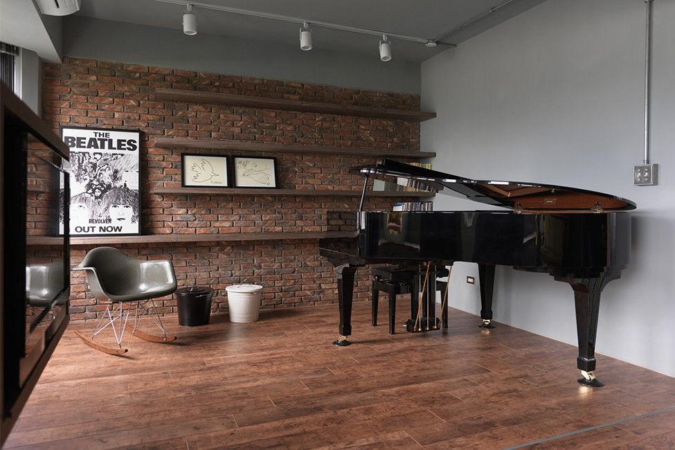
【TID Award】Wandering Boundaries
地點 Taipei, Taiwan 時間 2014 攝影 小雄梁彥
(2014 TID Award of Residential Space)
主要設計/楊鈞凱
參與設計/呂午城
I 環境 CONTEXT
基地臨近淡水河岸,規劃重點在於將河岸景色在室內展開。
Located at the east side of Tamsui River in Taipei, the apartment facing the ... stunning river-view and iconic Guandu Bridge.
In defining the new use of space, in accordance with the client's needs, we try to maximize the entering of daylight and view and the visual interrelationships between the different parts of the house, each with its own identity.
II 面向 ORIENTATION
在既有的建築框架下,創造空間的多變性,空間不再有單一的說明或定義。不再是空間定義生活,而是生活定義空間。
The aim was to give the occupant various possibilities of space, to create diversity inside the apartment as well as to enable the clients to enjoy the view of the surroundings where they live.
The striped glass of the sliding partition allows light to filter while at the same time provides some privacy for the library/piano room.
It is a compact apartment with multifunctional elements to provide flexibility and adaptability to different needs, in other words, a 'mini-space' with a 'maxi-functionality' + 'maxi-view'.
III 空間彈性 FLEXIBILITY
在有限的面積內達到業主期望的多用途空間,同時兼顧領域與視覺的聯結。
1. 藉由活動電視柱轉動,改變室內空間面向。
2. 以半透明拉門改變琴房使用的方式(區隔/開放)。
In order to allow the occupants to live with greater freedom within a limited floor area, we connect and overlay the various places to create the whole of the dwelling.
The open-plan layout also allows for better cross-ventilation through the apartment.
IV 音樂與閱讀 MUSIC VS READING
業主是一對年輕夫妻,丈夫是醫生,妻子是音樂教師,因職業而產生的分享與差異可以在空間中體會。The rotatable TV column changes the orientation of the space according to the number of occupants and the function/activities of the room.
V 餐食 CUISINE
廚房動作可流入開放的餐廳/起居區,夫妻互動不受限於空間。在此以綠色代表清新。The opaque sliding partition behind the chalkboard act as the 'invisible wall' throughout our planning, is a wide and bright shared area which becomes a gentle buffer between spaces, and also a link between husband(dentist/books) and wife (pianist/piano).
VI 顏色 COLOURS
為了呈現對都市河岸的房子的想法,我們選擇使用簡單的材料塑造空間:紅磚、黑鐵、木板。
- 起居開放空間以灰色來呈現穩定的永恆。
- 廚房作業區以綠色定義清新。
- 紅色在客浴裡代表熱情與活力
- 退到後方的主臥以深藍色呈現寧靜和情感。
- 黑色主浴代表隱蔽與隱私。
The simple, natural and affordable materials such as raw brick, steel, plywood and formica are designed to enhance the sense of space in the apartment and also reduce costs.
Low-cost materials have also been used in the bathroom, where inexpensive mosaic tiles are arranged in different colors to give the two bathrooms a more bespoke look.
In order to create accents, colors is used in different spaces.
- GRAY for living : Stability/ Security
- BLUE for bedroom : Peace/ Tranquility/ Sincerity/ Affection
- RED for powder room : Passion/ energetic
- BLACK for bathroom : Sophistication
- GREEN for kitchen : Freshness
More